As user experience professionals, most of us have worked with Nielsen and Molich's 10 heuristics or rules of thumb and Ben Shneiderman's Eight Golden Rules. These are user interface principles that we need to learn and apply. They are part of the "package" of knowledge about human-computer interaction. With the expansion of the UX field and its infiltration into many aspects of the enterprise, we will increasingly need to address product design. Therefore, it is always useful to learn from other design disciplines.
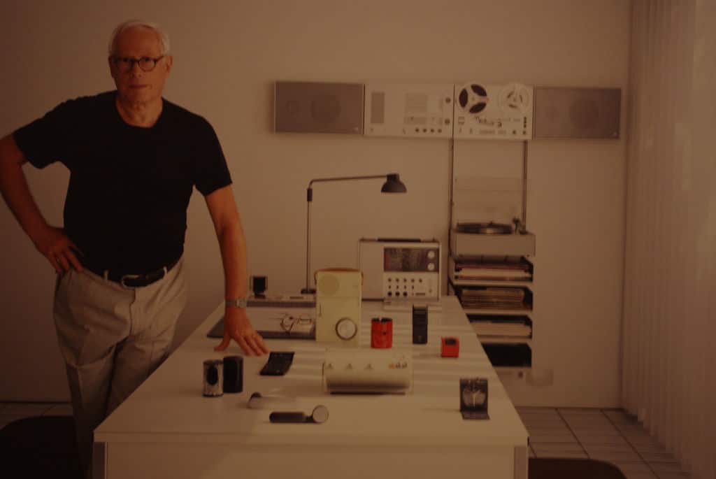
Dieter Rams is a German industrial designer who was responsible for the design of Braun's consumer products for many years. Some 50 years ago, in his quest to answer the question "Is my design good design?", he developed the 10 principles of good design, sometimes also known as the 10 commandments. It is surprising to see how valid these principles are today, to the point that we might feel them even more than we did then, when Rams wrote them.
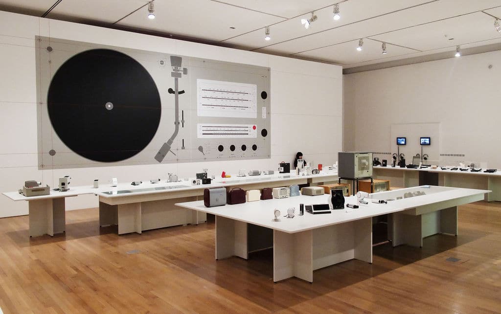
Both consumer products and technology have changed enormously. Even the aesthetics have changed considerably and many of Rams' designs look dated to most of us, or modern and "trendy" if you are a fan of 1960s and 1970s designs. Despite all these changes, the commandments are still valuable guidelines for anyone working in design, and not just for industrial designers, but also for you, the user experience designer.
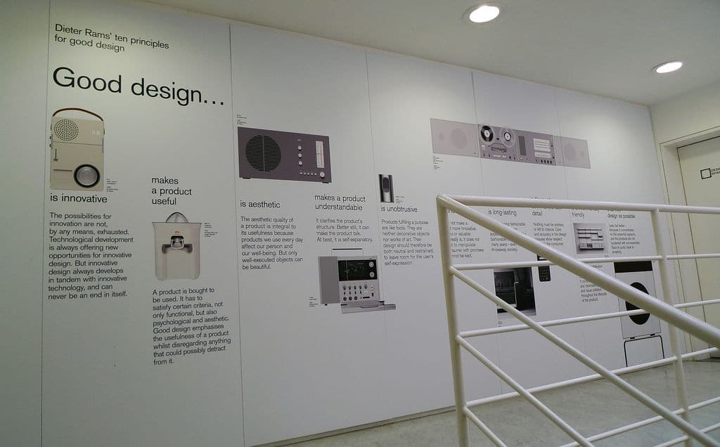
According to Dieter Rams, good design:
1, It is innovative
2, makes a product useful
3, It is aesthetic
4, Makes a product understandable
5, It is discreet
6, Is honest
7, It is durable
8, It is meticulous down to the last detail.
9, It is environmentally friendly
10, It involves the smallest possible design
Let's look at each of them in a little more detail.
- Good design is innovative. The possibilities for innovation are far from exhausted. Technological development always offers new opportunities for innovative design. But innovative design always develops along with innovative technology, and can never be an end in itself.
- Good design makes a product useful. A product is purchased to be used. It has to meet certain criteria, not only functional, but also psychological and aesthetic. Good design emphasizes the usefulness of a product and dispenses with anything that might detract from it.
- Good design is aesthetic. The aesthetic quality of a product is an integral part of its usefulness because the products we use on a daily basis affect us as individuals and our well-being. But only well-executed objects can be beautiful.
Good design makes a product understandable. Clarifies the structure of the product. Better yet, you can make the product do the talking. At best, it is self-explanatory. - Good design is discreet. Products that serve a function are like tools. They are not decorative objects or works of art. Therefore, its design should be neutral and restrained, to leave room for the user's self-expression.
- Good design is honest. It does not make a product more innovative, powerful or valuable than it really is. It does not attempt to manipulate the consumer with promises that cannot be kept.
- Good design is durable. It avoids being trendy and, therefore, never looks old-fashioned. Unlike fashion design, it lasts for many years, even in today's throwaway society.
- Good design is meticulous down to the last detail. Nothing should be arbitrary or left to chance. Care and precision in the design process demonstrate respect for the user.
- Good design is environmentally friendly. The design makes an important contribution to the preservation of the environment. Conserves resources and minimizes physical and visual pollution throughout the product life cycle.
- Good design is as little design as possible. Less, but better, because it concentrates on the essentials and the products are not loaded with non-essentials. Back to purity, back to simplicity.
In web and application design, we are surrounded by state-of-the-art applications and software. Therefore, a common danger is that we innovate for the sake of innovating. If we look for meteorological applications, we will find an endless number of them. From those that actually serve a purpose - for example, Umbrella - to those that focus solely on design or features that no one really needs. We should think about the must-haves in this case and be wary of introducing "delectables" unless we are sure they are innovative and serve a purpose for our users.
Even when designing digital interfaces, we can keep Rams' commandment in mind and make our web designs useful:
Making it easy to interact with them to the point that the user delights in them. This is user enjoyment through user enablement.
Our design must always show the user what its function is, so that there is never a gap between what the user perceives the capabilities of the design to be and what they actually are.
Design with a view to guide our users to the necessary interactions. We should make the buttons look like clickable buttons and think about positive and negative interactions. Think of traffic lights: green means go (positive); red means stop (negative).
Do not build unnecessary elements into our designs. Remember the 80/20 rule and think carefully before adding each item to avoid clutter.
What are you designing for? Is it a bank, where security badges and padlocks are required and the use of a blue color scheme always reassuring? Make your design reflect the character of the design intent and remember that, on the scale between engineering (functionality without aesthetics) and art (aesthetics without function), we are in a unique position: design.
Good design can speak for itself, without asking the user to make much effort: showing is better than telling. If a user can intuitively figure out what to do with your design, it's an ace! If you have to write instructions for me to interact with it, it's not so good. In your design, think about the following: can you reduce the cognitive load on the user so that the design has already done the thinking for them and all they have to do is play along and interact?
Yes, we are designing for the digital realm, so we have a challenge that mechanical products did not have. If you look at a hair dryer, you can tell right away what needs to be done. Looking at the design of a website or an application requires a greater mental investment. As long as we can make our designs understandable and flow in a way that our users can interact efficiently, there is a good chance that we can avoid creating user frustration.
Surely this sounds familiar, in terms of how we design so that the user can maneuver their creativity in the design. Digital design offers a lot of room for expression. Therefore, we have to design with an appropriate structure. Take Facebook and MySpace for example; the former has become a tableau where we forget about form and focus on content: what we say about our lives. MySpace didn't have that miraculous structure.
Designers can get caught up at times. Digital design is an abstract tableau, and we know that we often have to make concepts easy for our users. For example, the leverage point of applying skeuomorphism may lead to the wrong mental model for the user; one that could prevent them from recovering errors or becoming a more advanced user. Therefore, we should always consider all sides of the coin and choose the option that is best for the user.
We must be especially careful to avoid putting our designs in the "old" pile. The first way to avoid this is to make sure that your product/service serves a purpose, as we have seen with the previous principles. In addition, you can also try
Prepare our designs for the future by keeping them adaptable. Don't get locked into assumptions about "new ways forward".
Maintain a neutral aesthetic in design. For example, consider crisp, clear text (which will always be legible) versus playful typefaces that look "cool". Look at the font on the covers of pulp fiction books from the 1970s... they're old-fashioned, aren't they?
The web is a living medium. It is constantly updated. So the easier it is to maintain your design, the more likely it will survive on new devices. This means going back to basics and keeping an eye on the nuts and bolts of the design. Yes, we mean reviewing HTML to be prepared for what the future holds.
This is crucial for us in web and application design. Every detail must have its weight on the way to achieve the best UX. Therefore, think about every detail. Nothing may seem like an afterthought, including the "Forgot password?" screen. Error alerts are another aspect to consider. When do you customize a design to go further and reassure the user? During loading, do you display on the page a spinning hourglass, a message, a nice animation or... is everything left sterile and white, leaving users in doubt?
Looking at the carbon footprint is relevant to design. It may seem comical, but the clicks users make and the amount of time they spend on electronic devices add up.
If we imagine that the Internet is like the world, we are on the right track. Think about how you can design with impact and not clutter the Internet with unnecessary pages. That sacred minimalism of "less is more" reaches another dimension in this note.
Rams' signature phrase could be: "Less, but better". Simplicity in web and application design, as in mechanical design, is the ultimate goal to help users in the digital age. The Internet is saturated with designs with many elements. This can give us confidence that we can outperform competitors who don't know what they are doing wrong, but there is still a point where many users are wary of the Internet because over-designed sites dominate. Less is more, but "less thought" means "better". Making good designs means making them simple; making great designs means focusing only on the essentials. The ornaments should not be left out.
What you need to know
Dieter Rams' 10 commandments are proof of his minimalist and functional approach to design but, more than that, they are proof of his professional stance. Therefore, we can easily make these principles our values, our philosophy of how the design - therefore, the UX design - of any product or service should be.
A small example of how relevant his ideas are still relevant is the mobile myth that "mobile=less". Whenever you perceive this opinion, you can respond: "Exactly, less but better". We are sure that many more examples have come to mind when you read the principles.
In December 1976, he gave a speech in New York about his design work at Vitsoe. Here are the opening paragraphs:
"Ladies and gentlemen, design is a very popular topic today. No wonder because, in the face of increasing competition, design is often the only product differentiation that is really noticeable to the buyer.
I am convinced that a well thought-out design is decisive for the quality of a product. A poorly designed product is not only uglier than a well-designed one, but has less value and utility. Worst of all, it can be intrusive.
The designer who wants to achieve a good design should not consider himself an artist who, according to taste and aesthetics, simply dresses the products with a last-minute garment.
The designer must be the gestaltingenieur or creative engineer. Synthesizes the finished product from the different elements that make up its design. His work is largely rational, meaning that aesthetic decisions are justified by an understanding of the product's purpose."
He may not have mentioned user experience as such, but all his ideas exude the same philosophy and values. Even then, design was almost the only means of product differentiation. This is still very true today. As he pointed out, we, as designers, have to be creative engineers who solve people's needs and respect the 10 principles:
Good design is innovative. Good design must be useful. Good design is aesthetic. Good design makes a product understandable. Good design is honest. Good design is discreet. Good design is durable. Good design is consistent in every detail. Good design is environmentally friendly. And, last but not least, good design is as little design as possible.
We are still in awe of the wisdom of his commandments. If not, read it again.